IELTS Writing Task 1 – The Graph Below Shows Different Sources of Air Pollutants in the UK Sample Answers
Struggling with IELTS Writing Task 1? Check out our sample answer along with report plan for the graph on air pollutants in the UK and see how to tackle this type of question with confidence!
Table of Contents

Limited-Time Offer : Access a FREE 10-Day IELTS Study Plan!
Check out a sample IELTS Bar Chart question and answer to help you prepare and boost yourlar tasks and achieve a higher IELTS band score in the IELTS Writing exam.
Want to master IELTS Writing Task 1? Check out our comprehensive guide to understand the structure and boost your IELTS writing skills!
Given below is an example of an IELTS Writing task 1 line graph discussing the sources of air pollution in UK within a period. Let’s understand how to frame the article from the ideas we have.
Report Plan
Paraphrase paragraph: shows>illustrates; different>3 sources; between 1990 and 2005.
Summary/overview paragraph: (1) Industry being the highest in emitting air pollutants (2) the most significant fall in total amount of pollutants
Paragraph 3: describe total trend -figures for 1990,1999 and 2005
Paragraph 4: compares figures from the 3 sources, giving figures for 1990,2005.
Boost your IELTS Writing score! Buy the Comprehensive IELTS Writing (Academic) Band 8 Preparation Course today & excel in your exams!
Sample Answer
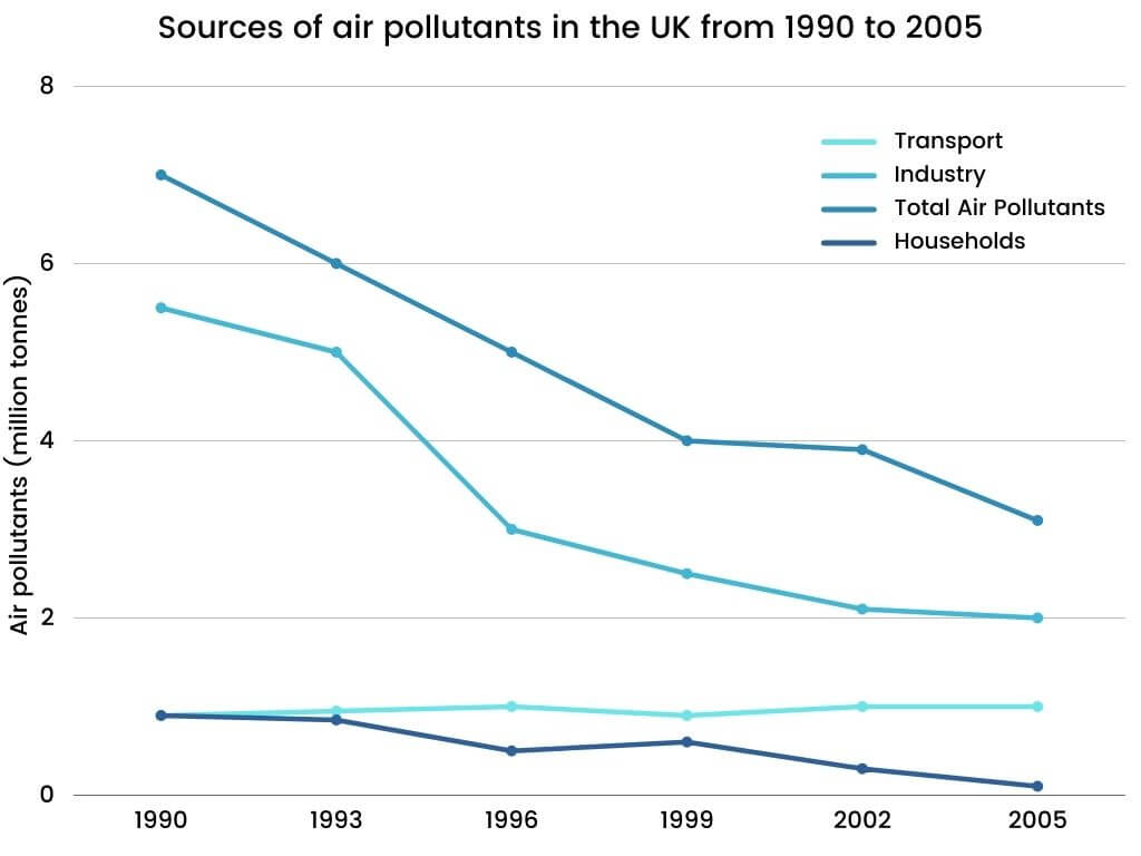
The line graph indicates the number of emissions released into the air from various sources in the UK between 1990 and 2005.
Overall, the number of air pollutants released by the industry was much higher than other sources. Further, there was a significant fall in the total amount of air pollutants from all the sources.
In the year 1990, around 7 million tonnes of air contaminants were emitted from all the three different sources which significantly dropped to approximately 4 million tonnes in 1999 and then continued to fall to about 3 million tonnes by the end of the period.
The total number of pollutants emitted into the air gradually reduced to about 5 million tonnes by 2005. Further, the industry with the highest amount of contaminants with 5.5 million tonnes in 1990 gradually declined to about 2 million tonnes in 2005. Despite the figures for transport and household emissions being equal at the beginning of the period, there was a slight increase in the number of air pollutants from transport to 1 million tonnes by 2005, while the household emission dropped to a negligible level at 0.1 million tonnes at the end of the period.
Register for an IELTS Expert Session today & gain expert advice to excel in IELTS Writing Task 1!
Also check:
Practice IELTS Writing Task 1 based on report types

Start Preparing for IELTS: Get Your 10-Day Study Plan Today!
Explore other sample Line Graphs

Janice Thompson

Janice Thompson

Janice Thompson
Recent Articles

Kasturika Samanta

Janice Thompson

Janice Thompson





Post your Comments