IELTS Academic Writing Task 1 Topic : Household income and spending on food and clothes
Table of Contents

Limited-Time Offer : Access a FREE 10-Day IELTS Study Plan!
In IELTS Writing Task 1 of the academic section, there will be a visual representation or a diagram on which you have to write a paragraph. One of these visual representations may be a pie chart. Given below is an example of an IELTS Writing Task 1 pie chart discussing household income and spending on food and clothes by an average family in a UK city within a period. Let’s understand how to frame the essay from the ideas we have.
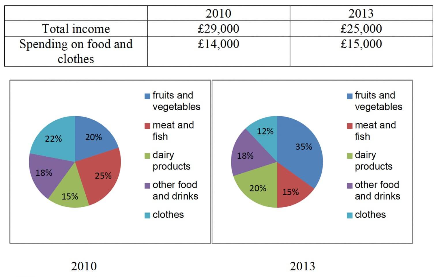
The information below gives details about household income and spending on food and clothes by an average family in a UK city in 2010 and 2013.
Report Plan
Paraphrase: Compares the total income per household in 2010 and 2013; portrays the disbursement of food & clothes.
Summary/overview paragraph: (1) total family income fell (2) percentage spent on fruits and vegetables rose significantly in 2013.
Paragraph 3: total household income fell; the proportion spent on food and clothes rose.
Paragraph 4: Compare spending on clothes (% falls). Give figures.
Paragraph 5: Compare spending on ‘other food and drink’ (stable) and (%) upsurge on fruits & vegetables and dairy products. Give figures.
Sample Answer
The table compares the total family income per household and their expenditure on food and clothes in 2010 and 2013. In contrast, the pie chart portrays the disbursement of food and clothes broken down into five categories.
We can observe from the table that the total income of the average UK household had fallen in 2013. In contrast, their spending on food and clothes gradually increased between the years. Specifically, the ratio of fruits and vegetables surged in 2013.
Throughout 2010-13, the total household income fairly decreased by £4000 to £25,000. Despite the declining trend, their expenditure on food and clothes showed a hike of £1000 from £14000 to £15000 in 2013.
On analyzing the expenditure on food and clothes in both the pie-charts, the proportion of both clothes, meat & fish gradually declined by 10% which reached 12% and 15% respectively in 2013.
On the contrary, expenditure on fruits & vegetables and dairy products was quite identical in 2010 at 20% and 15%. But then, there was a 5% and 15% upsurge in the expenses of the former and the latter in 2013. In contrast, the figure for other food and drinks remained stable at 18% throughout the given period.
Get evaluated for FREE!
Got a quick report in your mind for this question. Don’t hesitate to post the same in our comment section. We will evaluate the report/letter and email you the band score & our trainer’s comments. And, this service is entirely free.
Also check :
Practice IELTS Writing Task 1 based on report types

Start Preparing for IELTS: Get Your 10-Day Study Plan Today!
Explore other sample Tables

Janice Thompson
Recent Articles

Kasturika Samanta
Janice Thompson

Janice Thompson




Post your Comments